Tranquil Dawn is the Dulux Colour of the Year 2020
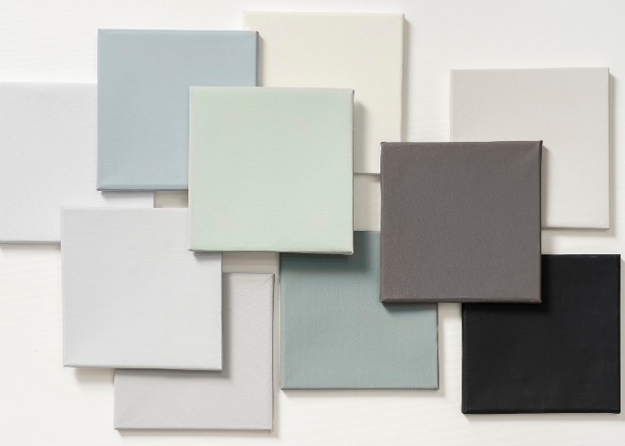
Soft and nurturing, the new Dulux Colour of the Year for 2020 is the perfect backdrop for your digital detox
Love to be ahead of the crowd? The colour experts brought together by paint specialists Dulux have named the shade they say will be hot for next year.
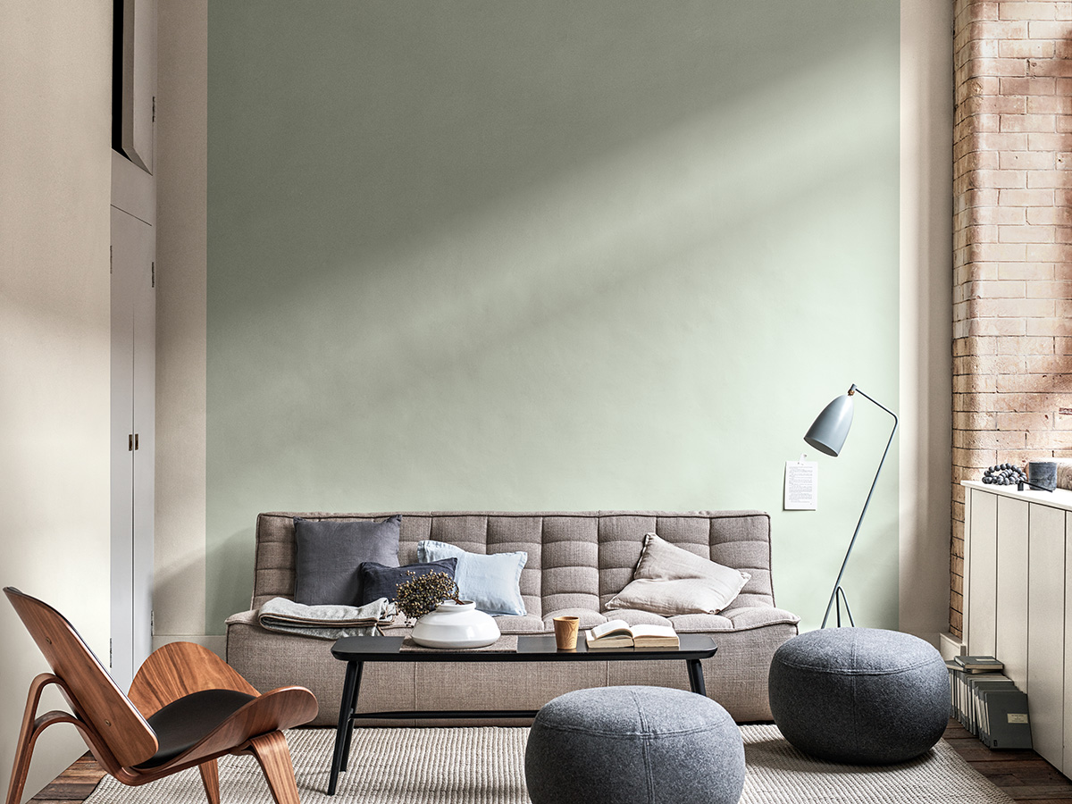
In contrast to last year’s terracotta hued Spiced Honey, the Dulux Colour of the Year 2020 is Tranquil Dawn, a soft misty green that’s much lighter and more ethereal than its predecessor.
The colour was chosen by an expert panel of trend forecasters, architects, colour designers, editors and design specialists at the impressive-sounding Global Aesthetic Centre in Amsterdam.
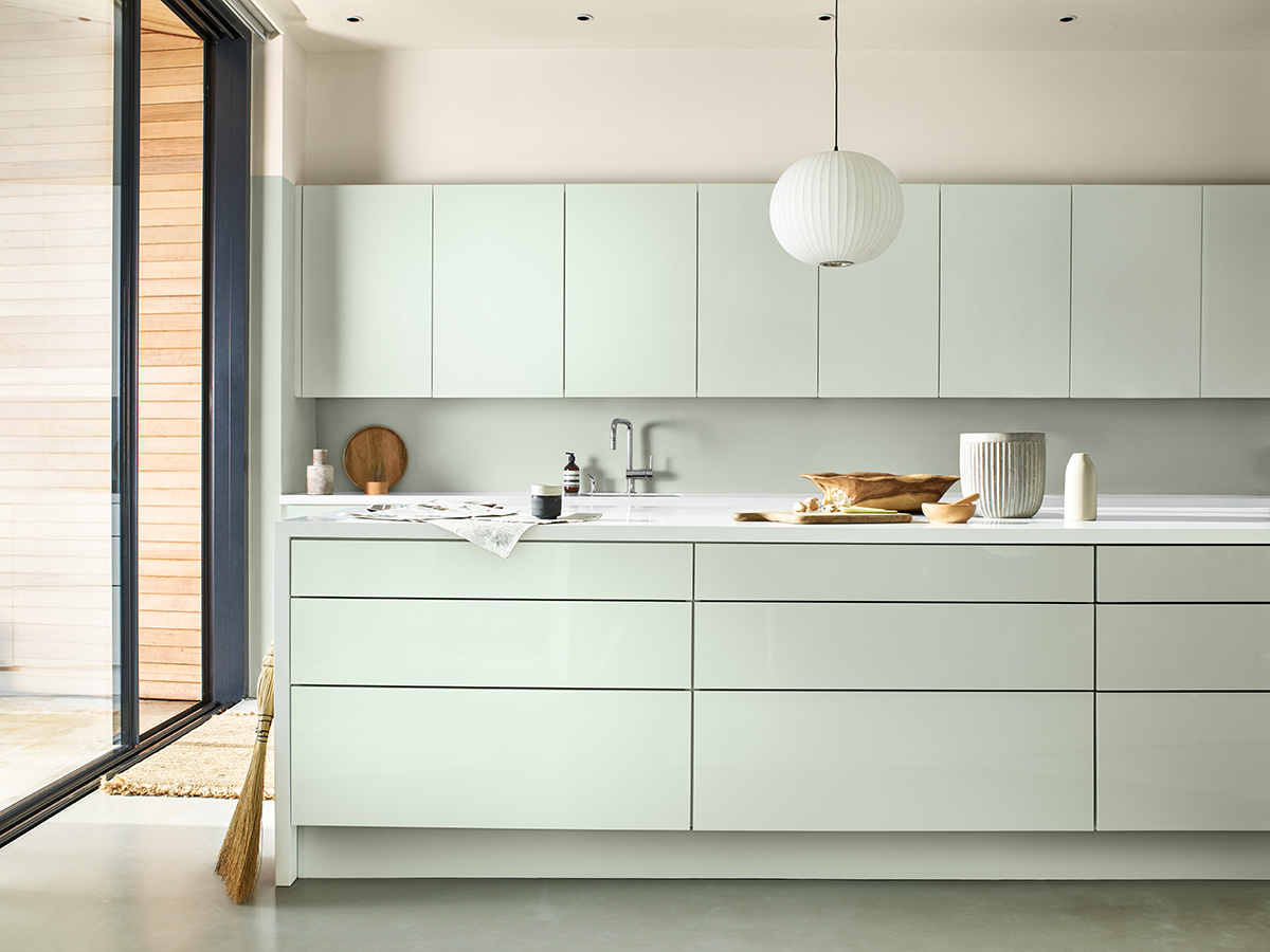
They analyse economic, cultural and social trends as well as the emerging popular colours to predict what we want in our homes for 2020 and beyond.
Read more: Colour combinations that are so wrong they are right
Now in its 17th year, the COTY has a canny tendency to be on the money – from 2017’s mid-blue bestseller Denim Drift to 2018’s dusky mauve shade, Heartwood, you can rest easy that Tranquil Dawn will be a fast way to futureproof your décor for at least 18 months.

Best of all, Tranquil Dawn comes as part of four new palettes that explore the themes of what it means to be human, inspired by the changing sunrises that paint the sky in different seasons called Meaning, Creativity, Care and Play.
Marianne Shillingford, Creative Director at Dulux UK, said: “A new decade heralds a new dawn and the hazy pale green tones of Tranquil Dawn are calming and comforting just when we need it most in our lives.
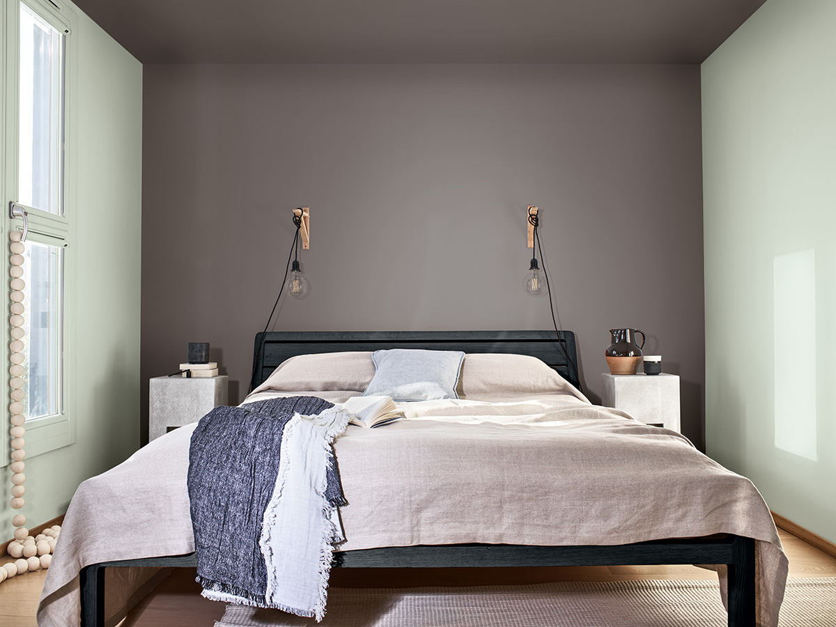
“Meaning, Creativity, Care and Play capture our growing desire to experience ‘The Human Touch’ at a time when we are questioning what being human is all about,” said Marianne, “and have been designed to make decoration with Colour of the Year simple.”
Ranging from soft chalky pastels to vivid reds and rich purples, there’s something for everyone. Let’s take a look at the four colour collections...
Meaning
Dulux says: “Inspired by a cold winter’s dawn, this minimalist palette features icy green, warm cream and charcoal hues, creating a feeling of calm and contemplation.”
We say: "This is a modern take on easy-to-live-with neutrals and is the most restful of all the palettes from Dulux. Every bit as cool and pearly as a dawn morning, we think every one of these colours is a winner."
Creativity
Dulux says: “Inspired by a warm autumnal day, a sumptuous palette with maroon and tobacco hues, pale and moss greens provides a sumptuous space for self-expression and storytelling.”
We say: “If you love rich jewel colours and darker interiors then this is the palette for you. The wine reds and earthy pigments look like the natural dyes used by the arts and crafts movement and will add sophisticated drama to any room.”
Care
Dulux says: “Inspired by a hazy spring horizon, this palette evokes a feeling of deep relaxation and peace thanks to a blend of earthy neutrals, muted greens, dusky pinks and pale blues.”
We say: “A more mature approach to the pretty pastels we've seen emerge over the last few years, use these to create a light yet laid-back feeling. We love the ever so pale pink called Faded Damson and the unexpected hit of two past COTY's; Denim Drift and Spiced Honey adding a punch of pigment.”
Play
Dulux says: “Inspired by the horizon of a hot summer morning, this palette features vivid reds, alongside baby blue, cream and pale green.”
We say: “Bold decorators will love the combination of the fiery red Rocket Fire with the cool green of Tranquil Dawn. This is about ramping up the saturation of nursery colours and then cutting through with the graphite Basically Black to give it a grown-up edge.”
Heleen van Gent, Head of AkzoNobel’s Global Aesthetic Centre, explains: “At the start of this new decade, the panel identified that the world has a growing desire to understand what makes us human.
“Against a background of increasing technological power, we want to understand our place in society and how we can make a positive impact on it. We need a fresh purpose, to be the architects of our own future and we are asking searching questions of both ourselves and society.”
Tranquil Dawn is available to buy from today - is it just us reaching for the paint brush?
Images: Dulux
Read more: Pretty in pink decorating ideas
Comments
Be the first to comment
Do you want to comment on this article? You need to be signed in for this feature


