Epic home fails: world's worst design and DIY mistakes
When home design goes horrendously wrong...
Architecture and interior décor are always subjective, but sometimes there's no denying the flaws. These unbelievable real projects will have you doing a double-take. Whether down to bad planning or terrible execution, these unfortunate houses have been stuck with shoddy fittings, poor choices, and inexplicable additions to rooms.
Click or scroll on to discover some of the world's worst home design fails...
Epic fail or epic time saver?
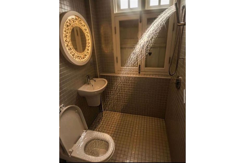
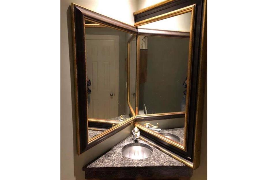
The intriguing design for this shower room featured on the hilarious Instagram account Please Hate These Things is either genius or baffling. Whichever way you look at it, you could save time by showering while using the lavatory, then clean the loo seat while rinsing off. That mirror is a curious addition too!
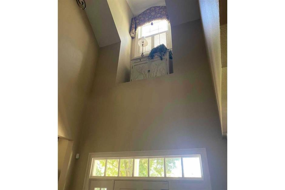
Random indoor balcony
Well, we don’t know about you but we love a pointless balcony like this one featured on another Insta account called Bad Real Estate Pics. Is it for surveying the hallway or delivering speeches to the household? It could be for greeting guests from above like a Roman Emperor, making everyone feel perfectly at ease and not at all uncomfortable.
Sponsored Content
Your life in your hands
Routine tasks like washing your hands take on a certain level of tedium – but if you’re missing the element of danger in your life, why not risk tragedy with this exciting electrical hazard in your own sink?
This incredibly ill-advised basin socket, shared via The Bad Agent on Instagram, could add real energy to your morning routine.
Corner (of the bedroom) bath
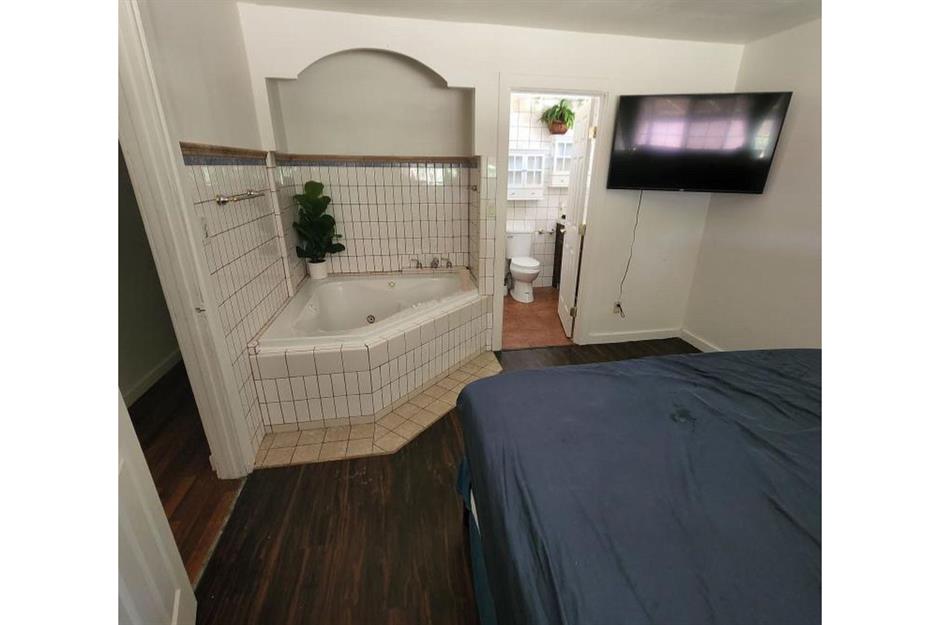
Real estate expert and broker Haley Haws took this photo while showing her clients around a home.
Open-plan living is all the rage, and ensuite bathrooms are still a covetable feature in any home. So why not combine the two and remove any shred of privacy left with this charming corner bedroom bathtub?
A challenging front door
If you’re not a fan of ‘drop-in’ guests and neighbours, have you tried re-positioning your front door? Try placing it approximately six feet higher than usual and watch as unwelcome visitors try and fail to enter.
Sponsored Content
A very tight squeeze
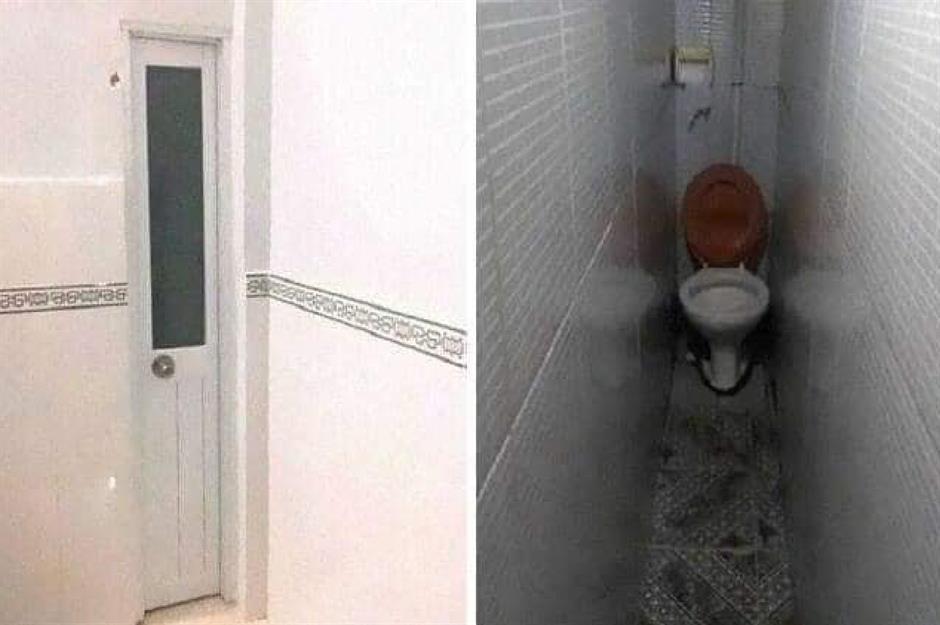
Face your fears of tight spaces with this space-saving lavatory. A claustrophobic nightmare, this hellishly narrow toilet ‘room’ doesn’t leave much space for breathing, never mind anything else. We rate it 0/10, would not recommend.
Watching soaps
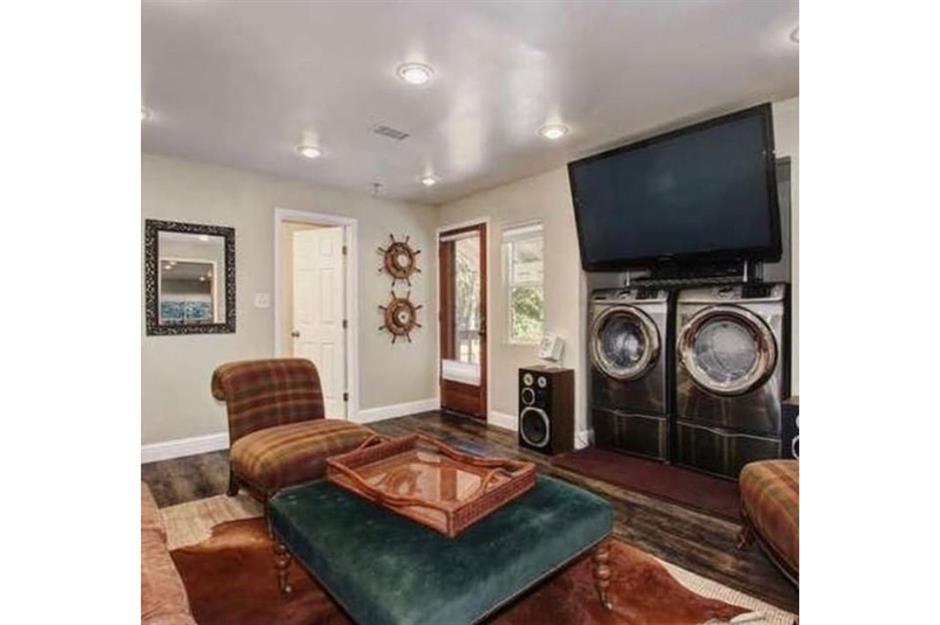
Don't have space for a utility area or a laundry room? No problem – simply make your living room multi-functional. Put on a load of washing while you catch up on your favourite shows and just turn the volume up when the spin cycle kicks in.
Intruders can't climb
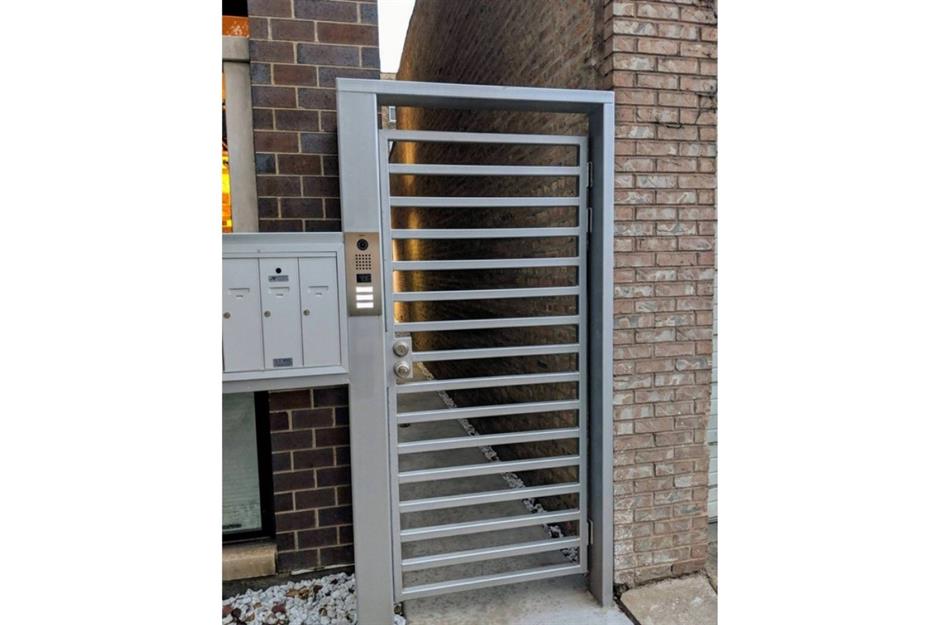
Many homeowners are concerned about safety, so having securing measures in place can never be a mistake – unless, that is, you completely misunderstand how to implement them.
Despite its coded entry system, this security gate comes with its very own built-in ladder, giving passersby the chance to climb over without the slightest bit of hassle. There's a chance this person's home insurance might be void...
Sponsored Content
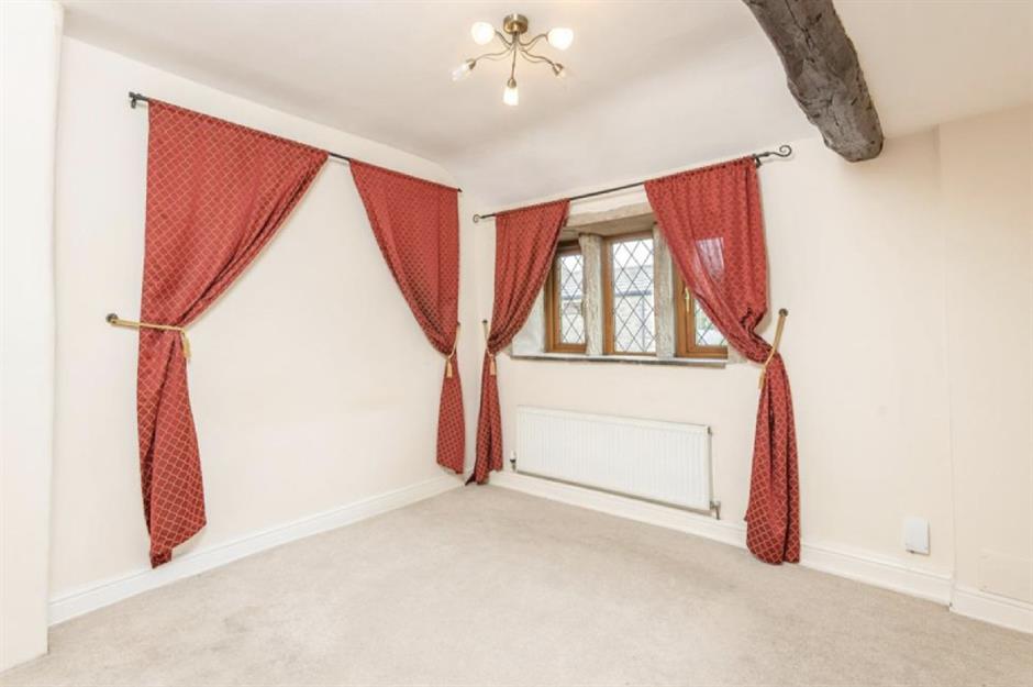
Curious curtains
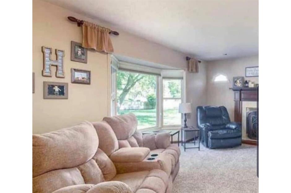
This seemingly ordinary living room is surely one of the strangest ones we've ever seen.
At first glance, everything appears normal but take a look at the curtains and you suddenly can't quite figure out what the homeowners were thinking. Are these covering the world's tiniest windows? Was there a misunderstanding in the soft furnishings store? Your guess is as good as ours.
Fireplace woes
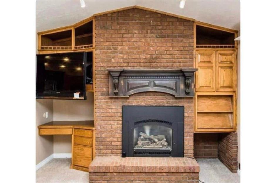
There's a lot to unpack with this one. Possibly America’s worst fireplace, this unique home addition caused quite a stir when this image went viral in 2021.
The weird mantel is only one area of concern with the design of this room – there's a TV above the desk and a random hole below the cabinets on the other side of the chimney breast. So much confusion!
Making the most of every inch?
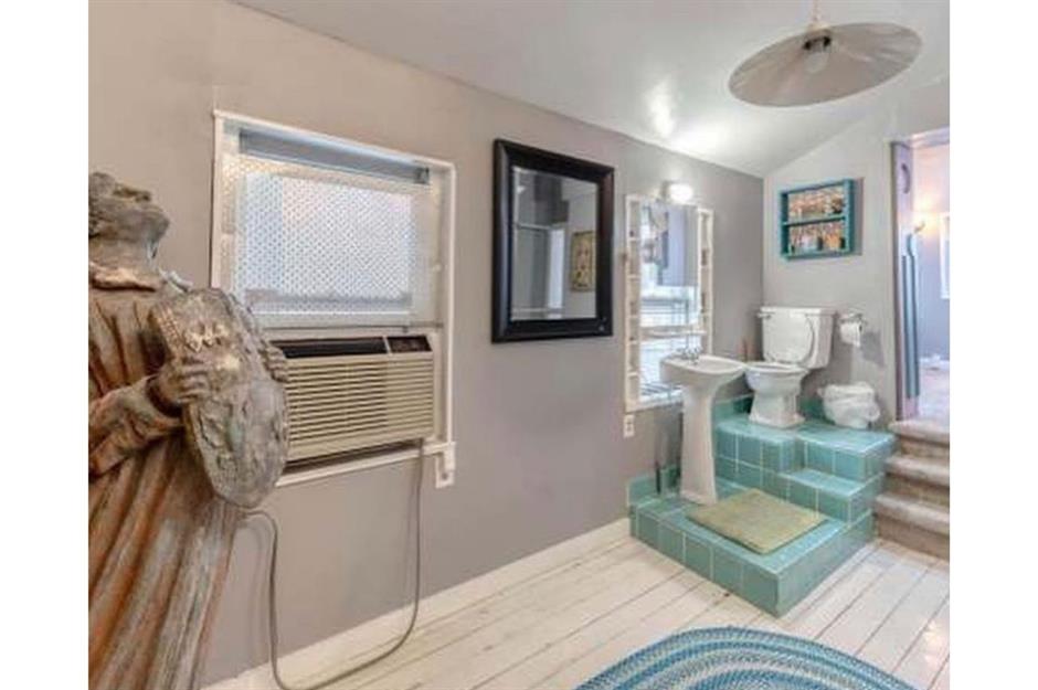
Who doesn't love a spacious bathroom? Well, we can't help but think that the owner of this property didn't quite make the most of the area they had to play with. Instead of spreading their bathroom suite out, creating a relaxed and contemporary room, they instead chose to compact everything into a single corner.
As Dina of @pleasehatethesethings put it: "God bless these 4 square feet!"
Sponsored Content
We're going to need a longer duster...
Another epic find by Dina is this incredible hallway. Described by her as "the perfect place to store 15 years' worth of dust", this unusual design choice must make cleaning a real chore for the owners. Plus, you'd need a stepladder to turn that lamp on and off.
Falling for this room
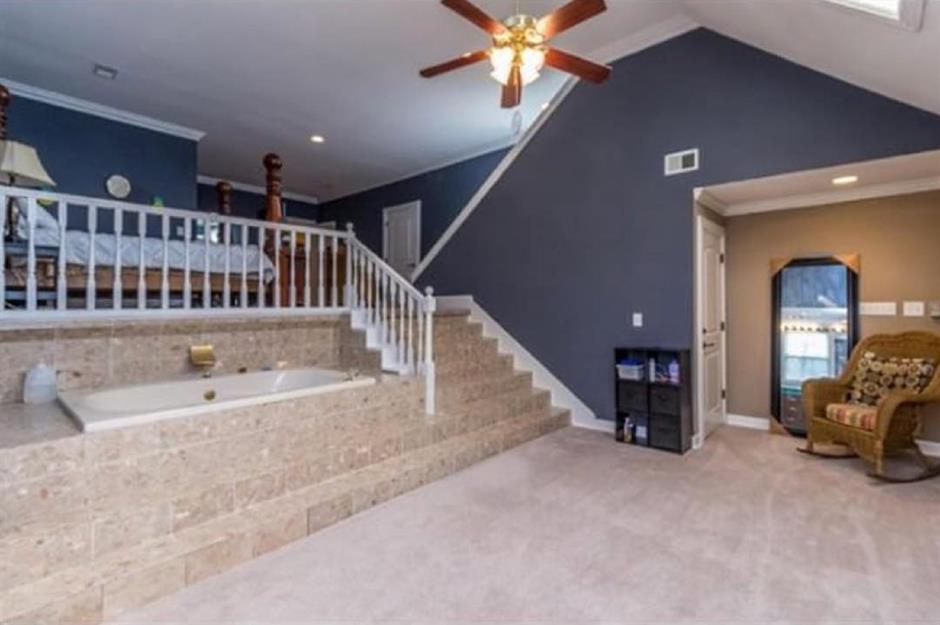
Is it a living room, a bathroom, or a bedroom? Well, this room has it all, including a raised tub. Aside from the weird interior design layout, using slippery surfaces in a wash space is never a good idea. Don't say we didn't warn you...
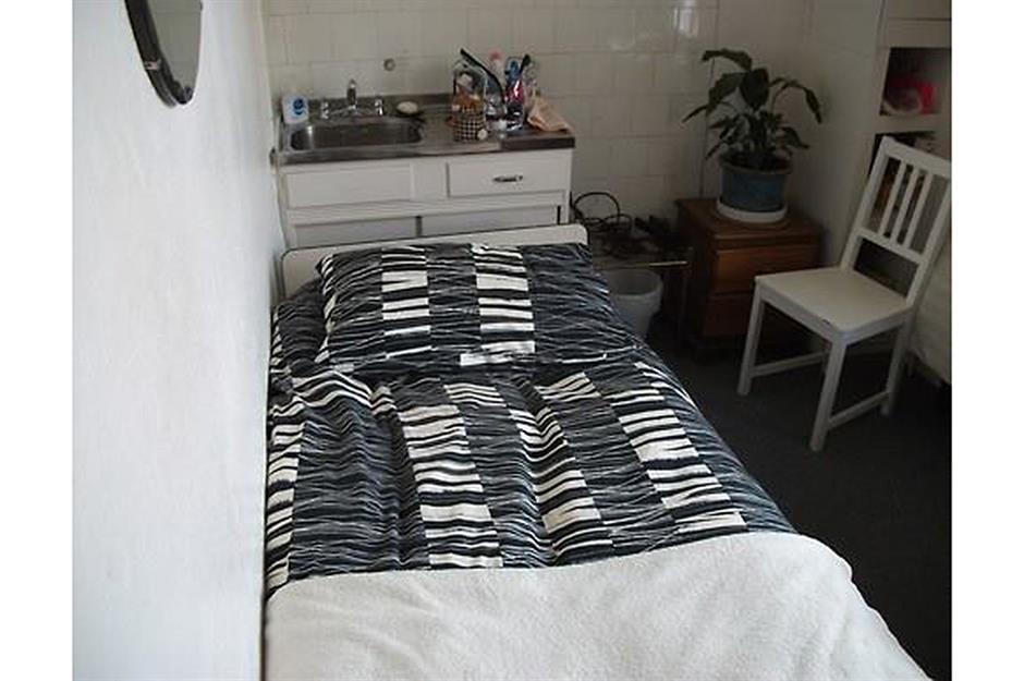
Tight squeeze
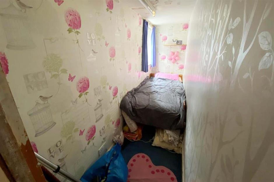
Sometimes you just have to accept you got the dimensions wrong, but not so with this compact box room, shared by the Facebook page Terrible Real Estate Agent Photos.
Rather than admitting defeat, the homeowner has seemingly persisted and squeezed in a single bed. We have a feeling it won't be budging anytime soon.
Sponsored Content
A toilet that doesn't fit
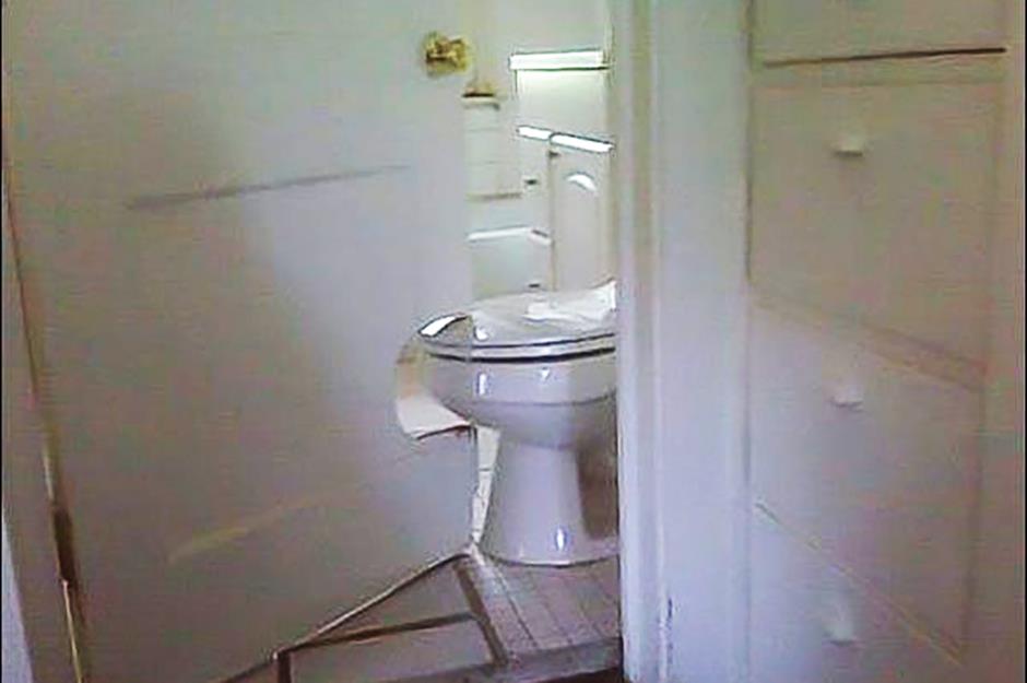
Perhaps the person that built this small bathroom thought that privacy didn't matter or maybe they forgot the golden rule of always measure twice.
It's hard to know what came first, the door or the toilet. The solution? A simple cut around the toilet bowl to allow it to open and close.
Mismatched mirrors
As well as being tiny, this sink unit makes us shudder; not least because it has no symmetry and doesn't match up. The real question is, where are the other halves of these mutilated mirrors? We can't imagine what the owner was thinking.
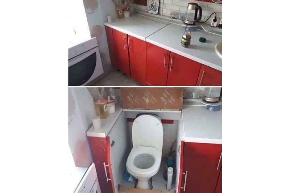
An unusual kitchen addition
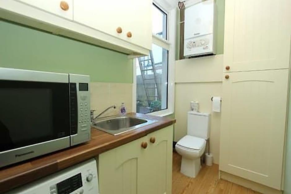
And the award for the weirdest kitchen goes to... whoever decided to put a toilet in their food prep area.
A huge design mistake, we aren't sure who thought installing a bathroom in a kitchen was a good idea. The very same room where you prepare and eat food isn't the best place to locate your 'porcelain throne'.
Sponsored Content
An off-centre chandelier
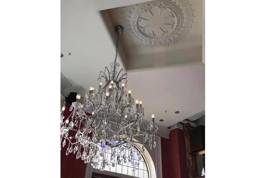
Geometry clearly wasn't a strong point for the person who fitted this chandelier. There's probably a practical reason why it's not sitting in the centre of the recessed ceiling – perhaps they had to find a reinforced beam – but really there is no justification for this absolute shambles.
A mismatched duo
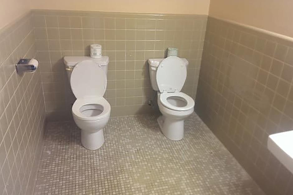
Parallel toilets, anyone? Perfect for the couple that can't stand to be apart for any length of time. Notice how one of the facilities is slightly bigger than the other and definitely closer to the toilet paper. This could be divorce territory.
An open-plan space
We are all for spacious open-plan living, however, this design from Terrible Real Estate Agent Photographs takes the award for the world's worst studio apartment. A kitchen sink located behind the headboard of a bed is a bit too close for comfort.
Sponsored Content
A steep approach
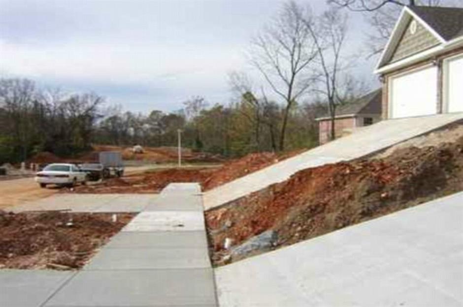
It goes to show that designing the outside of a property can be just as hard as getting the interior right. This 45-degree driveway makes steep work of getting home and we imagine it ruins the underside of your car, too.
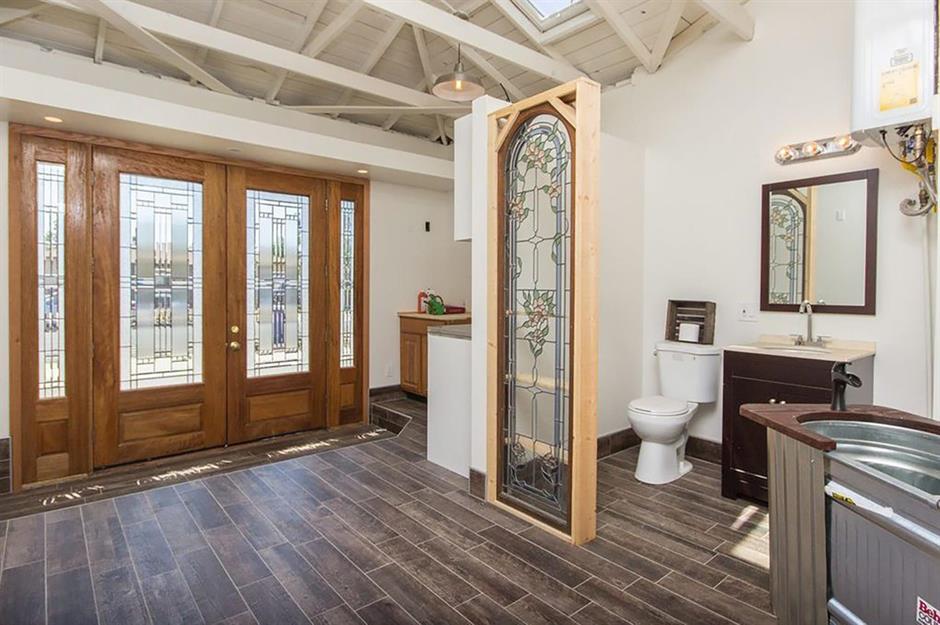
A grand entrance
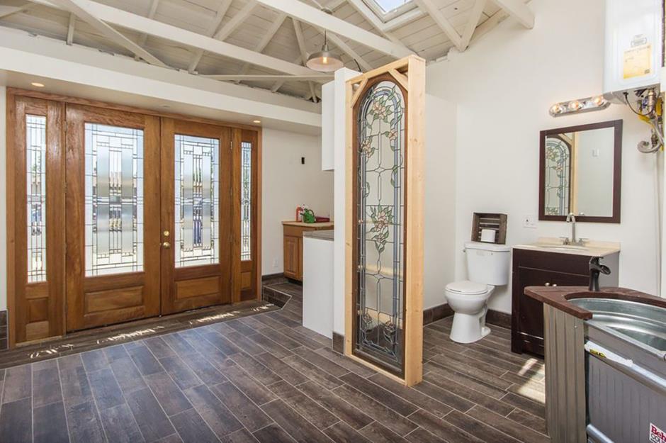
If you're going to put a toilet in your entrance hall the very least you can do is put a stained-glass modesty screen in front of it, like this considerate design maverick has. Even an opaque panel would have been preferable to this.
A multipurpose bathroom
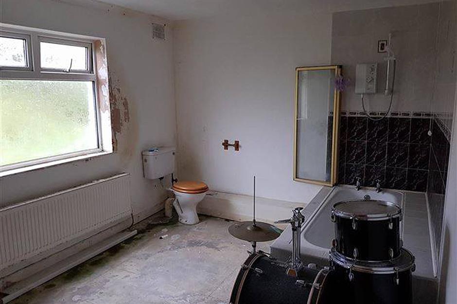
One for music lovers, the location of this kit is something of a mystery. Can you imagine taking a relaxing bath while someone casually practices the drums? It's definitely a bathroom design mistake.
Sponsored Content
A balancing act
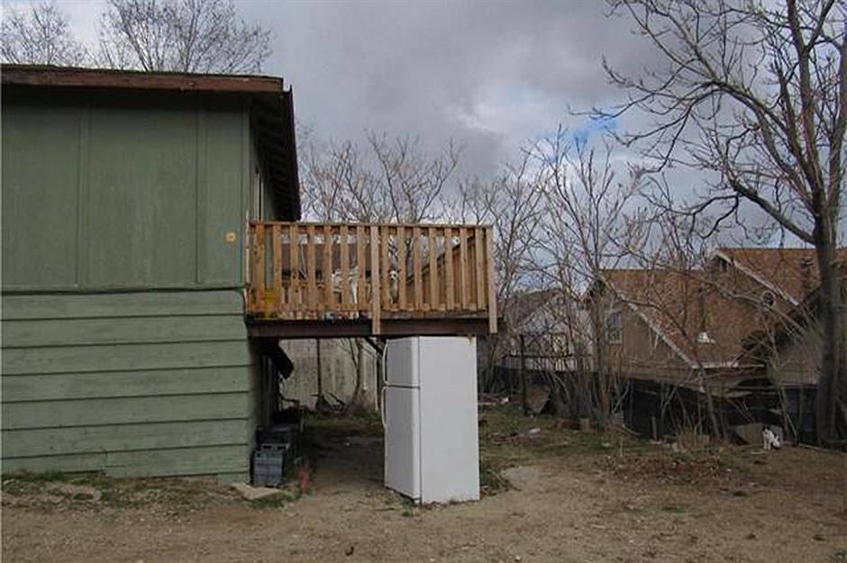
A well-designed balcony can be a little patch of paradise and is often a selling point for a house, but this outdoor space, which appears to be propped up by a fridge, would put fear into even the bravest of prospective buyers.
Putting down roots
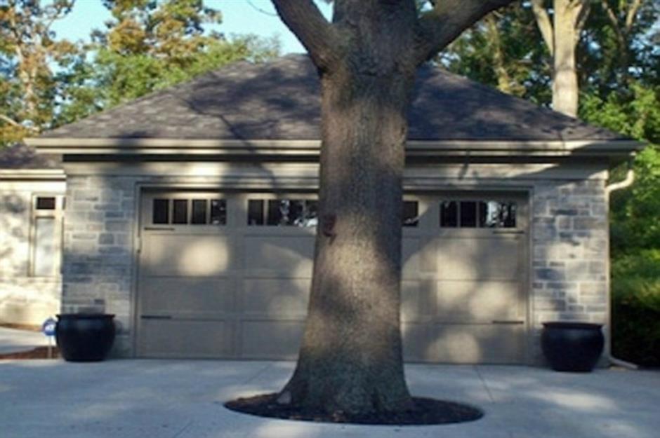
Another less-than-brilliant example of logical thinking is seen in this picture taken of a garage in Sarnia, Ontario, Canada. The question is, did someone plant a tree in front of the garage door or did some genius build a house behind a giant tree?
Imperfect patterns
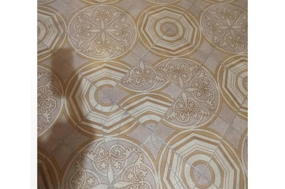
These floor tiles will have the perfectionists among us reeling. There are no missing pieces and the design is perfectly symmetrical until you spot the epic fail right in the centre.
We wonder if it was deliberate and, if not, what happened to the tiler to make them lose control like this?
Sponsored Content
Is it a bathroom or a kitchen?
A bathtub in a kitchen is wrong for so many reasons, hygiene being just one of them. At least the occupant can save on water by washing dishes while they bathe, right?
Infuriating hob design
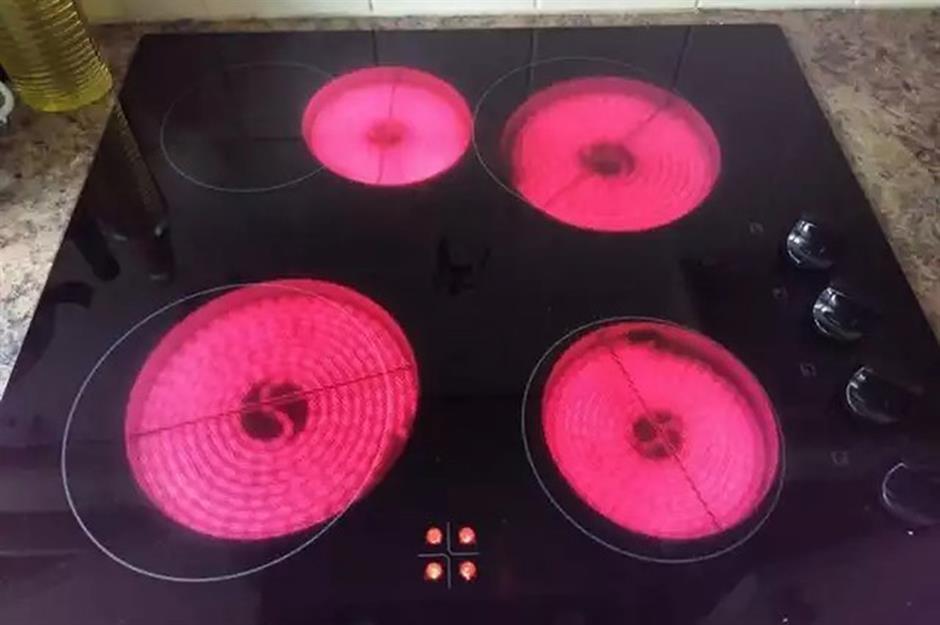
We love symmetry, so this wonky hob design was bound to drive us crazy. Highly infuriating, we can't help but wonder if the glass top was made for a different cooker.
A problematic door
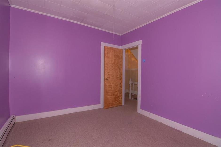
As the saying goes, as one door closes, another opens. However, in this time warp home it's a fault rather than a feature. Looking closely at the one-way doors blocking each other's access in this vivid purple room we have to ask, what happened here?
Sponsored Content
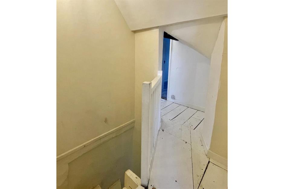
An attic design disaster
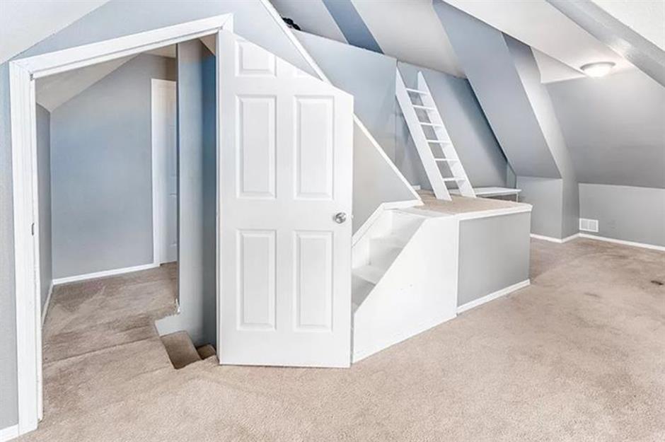
There are a lot of standout features in this oddly designed attic room – not many of them are good. From the sawn-off door that looks like it wouldn't fit, to the oddly angled walls and the staircase that sits over the door frame, it's full of baffling design mistakes.
A very public toilet
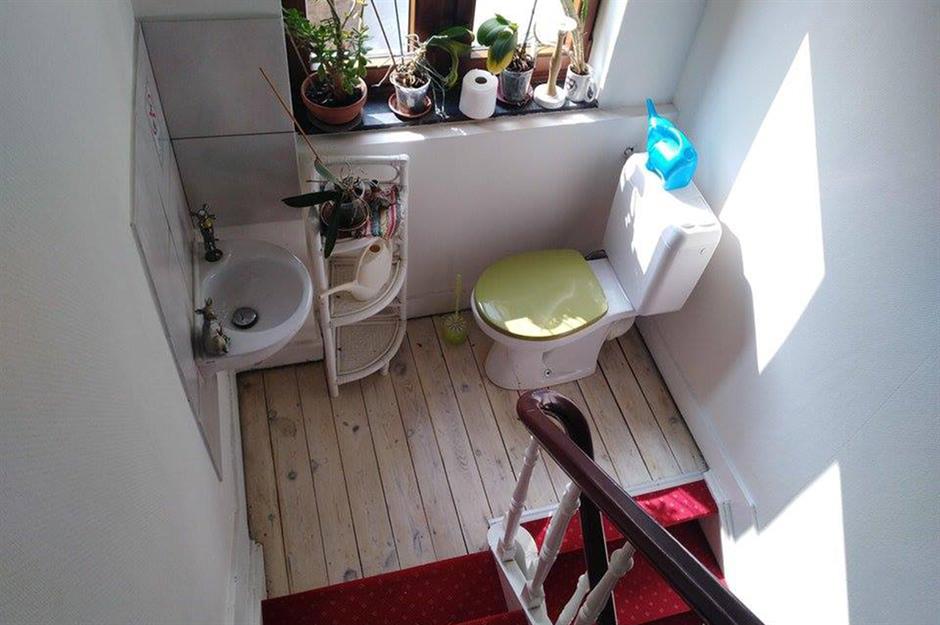
Some might say the location of this toilet is convenient, but others would call it bizarre. Located in the middle of a landing between floors, it's hardly a private spot for what many would consider a solitary undertaking.
Make a wish
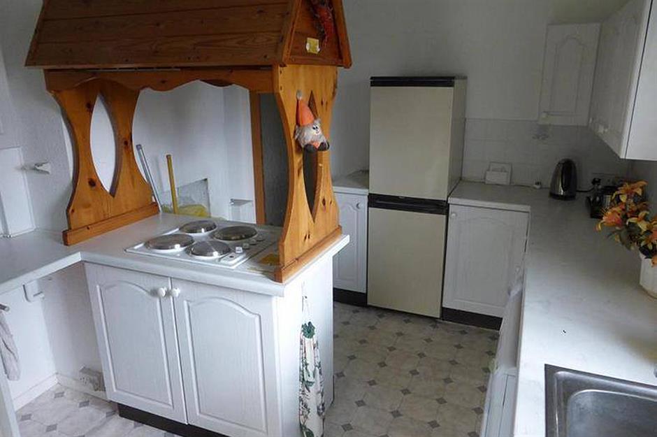
What would otherwise be a perfectly normal kitchen has the unusual addition of a wishing well frame above the hob. We'd throw a penny at it to wish it away!
Sponsored Content
Crooked bricklaying
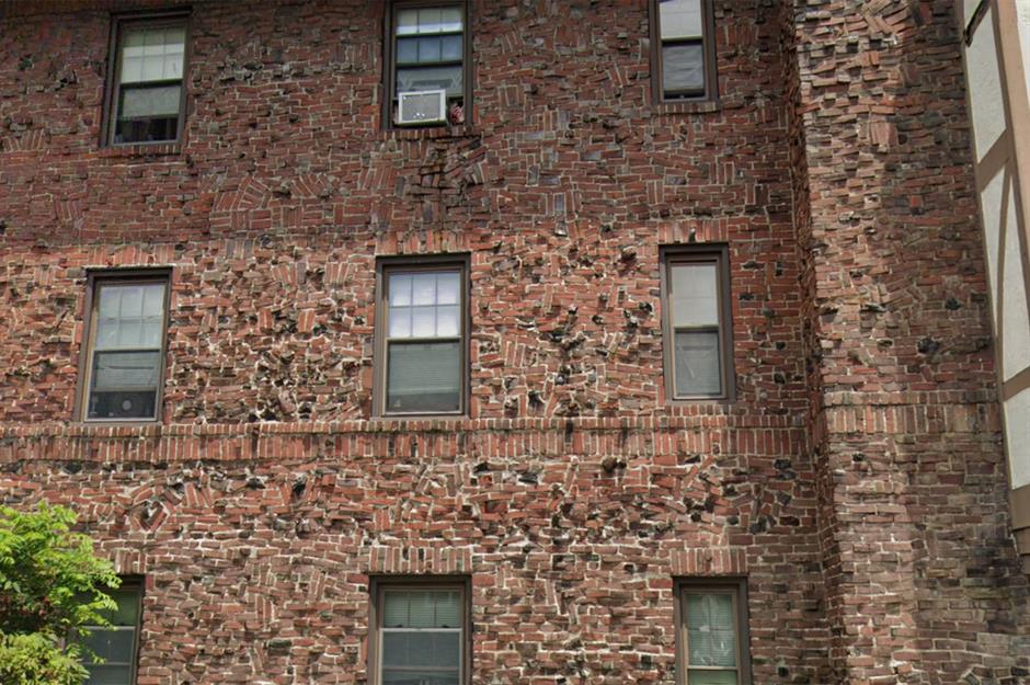
From a distance, the exterior of this Pennsylvania, USA apartment block looks like any standard red-bricked façade. But look more closely and it's clear to see the bricklayer struggled to keep the design uniform.
We can't help but wonder if it was more difficult to lay the bricks like this than to do them properly.
A precariously placed bath
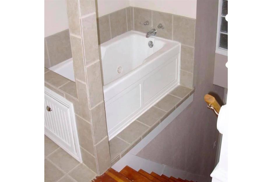
Getting out of a bath can be treacherous at the best of times but you could be taking your life in your hands disembarking from this crazy tub. We're all for space-saving solutions but perching this on the edge of the stairs seems borderline murderous.
DIY disaster
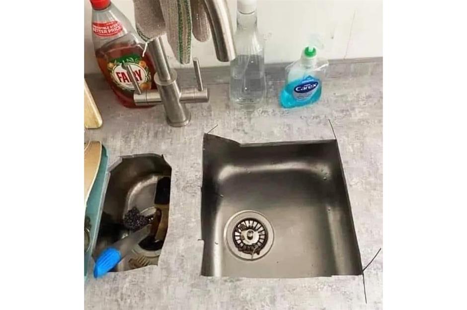
Some things are best left to the professionals rather than be tackled by enthusiastic but ultimately clueless homeowners, like this DIY countertop installation. At least, we hope a professional didn't install this...
Sponsored Content
An extra bathroom addition
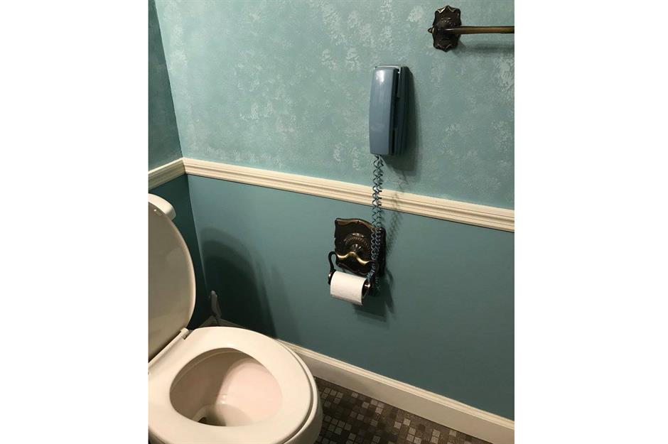
This isn't the usual bathroom setup, but we guess it could come in handy in an emergency. At least the colour of the phone matches the décor.
The doors to nowhere
It appears to be a normal house from the front, but this property has an epic design fail hidden around the side. Either some balconies need to be added or the doors that lead to nowhere need to be removed (preferably from our memories, too).
Working up a sweat?
While the working day can get a little stressful, and sometimes we have to work longer hours than we’d like, we’re not sure installing a shower in the corner of the office is entirely necessary. Particularly one with this extraordinary lack of privacy. But hey, each to their own…
Sponsored Content
A sobering staircase
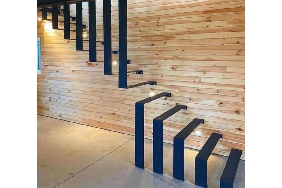
A challenge at best, this ‘staircase’ would become a life-threatening trek should you need to find the bathroom in the middle of the night. Hopefully, the owners have excellent balance, nerves of steel, and don’t own a dog.
Escher-style stairway
Like looking at an optical illusion, we’re half expecting to find a hidden image if we stare at this design choice any longer. Ascending this stairway would require some acrobatics and mental gymnastics just to reach the second floor.
Incredible invisible sink
Who needs a sink anyway? Perhaps the designer of this tap area took inspiration from Kim Kardashian’s incredible disappearing sink – but just forgot to actually install one to begin with.
Sponsored Content
Challenging balconies
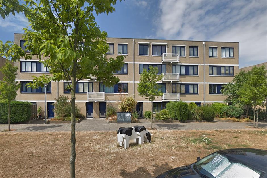
No amount of zooming in can help explain the positioning of these balconies on an apartment building in Haarlem, Netherlands.
Even if the windows open wide enough to allow awkward access – still a health and safety hazard – you’d have to be in the mood to share your balcony with your neighbour. And don't even get us started on that cow...
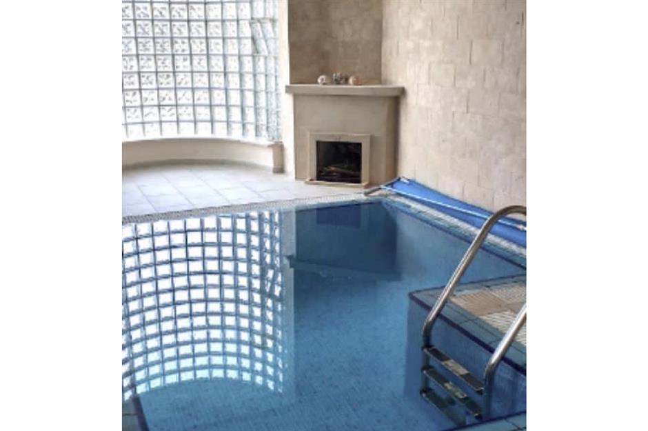
Just a heated indoor pool
Many questions spring to mind when looking at this setup. What came first – the glass block window wall or the fireplace? And what happens if you decide to jump into the pool? Wouldn’t the inevitable splash cause the fire to go out? Design choices were made.
The mysterious disappearing window
Perhaps this interesting curtain placement has a reason we just don’t know about yet. Maybe there once hung a prized artwork that needed to be unveiled and it has since been stolen. Or maybe someone very slim liked to perform from behind these mysterious red curtains.
Sponsored Content
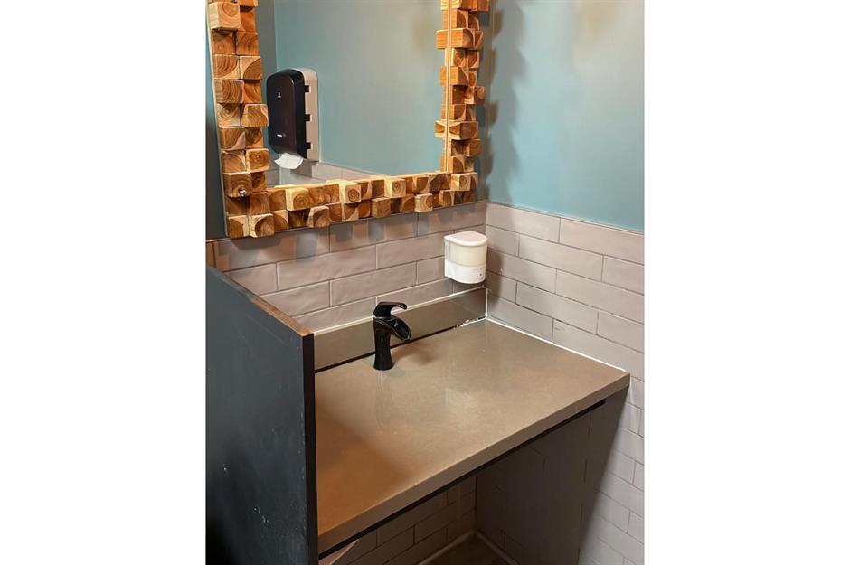
Convenient kitchen feature
Taking convenience to new heights, this efficient kitchen cabinet hosts a very desirable integrated ‘feature’. Who doesn’t want to use the lavatory in stunningly close proximity to the coffee machine and oven? When nature calls while you're cooking your dinner, you’ll be happy with this hidden design.
Designed by a cat?
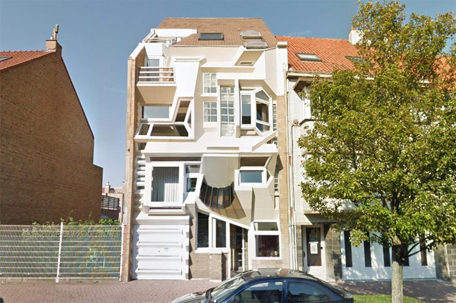
This bizarre home in Ostend, Belgium is a bit of a local celebrity and was designed by German architect Rudolph Joseph in the 1980s. But the strange design was declared a home design fail when photos of it surfaced online in a Reddit group called 'Urban hell'.
One commentator labelled it an "insulation and cleaning nightmare", while another said it looked as if had been "designed by a cat". Yet another mused whether the architect had crumpled up the paper plan and the builders hadn't realised. One even pleaded for it to be bulldozed, which we think is a little harsh.
Anxiety-inducing entrance
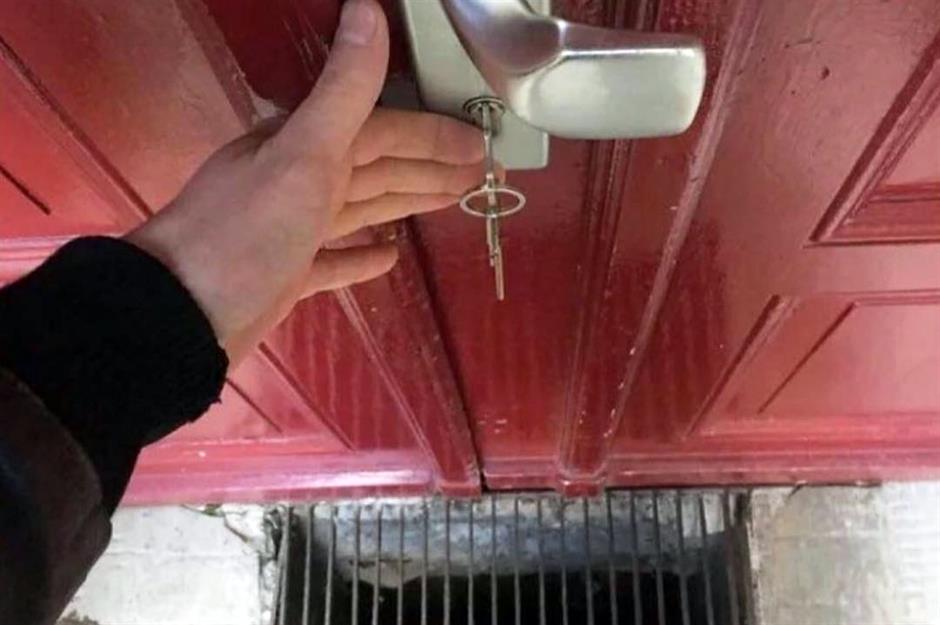
While the designer of this home may have considered it smart to place a drain next to the front door to avoid flooding, it's enough to cause an anxiety spike in those with butterfingers.
One fumble of our keys would have us yelling "Oh grate!"
Sponsored Content
Disco deities
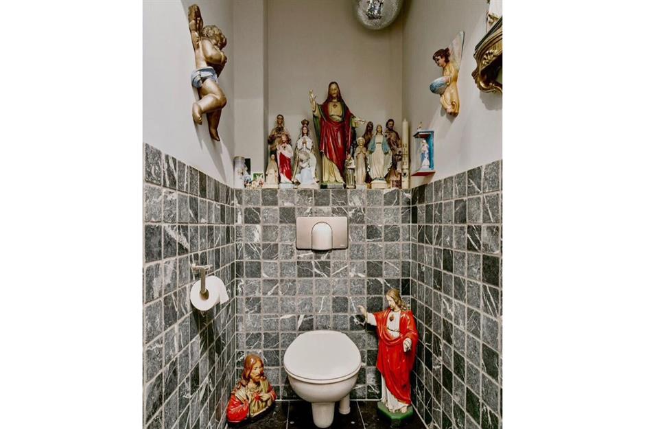
While many of us would be glad to have a religious figure watching over us, we're not sure we'd want him watching over us in the smallest room of the house.
The addition of the disco ball makes us think these figurines party while this homeowner's back is turned.
In-suite or ensuite?
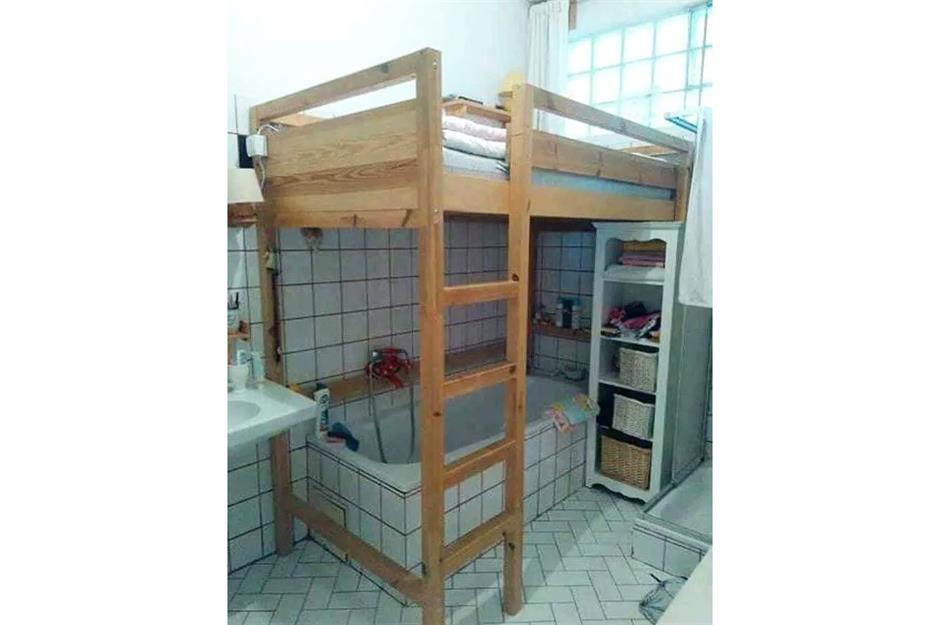
Thanks to housing crises in many of the world's major cities, this intriguing setup may become more common that we'd like.
While it's certainly an ingenious space-saver, it might not be what everyone expects when viewing a 'one bed, one bath' apartment.
SalvaDOOR Dalí
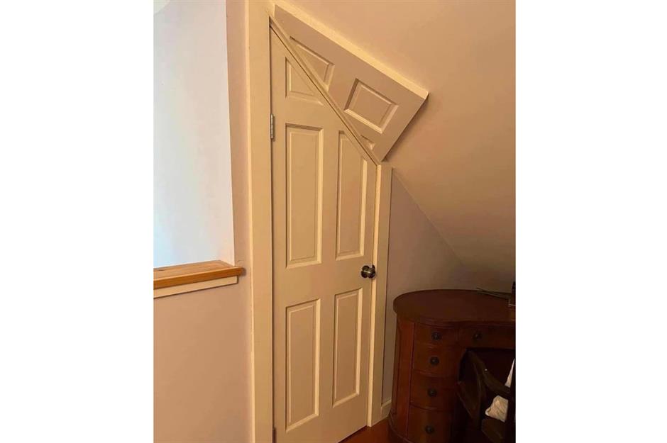
There's something to be said for designing fun and unusual features simply for the sake of it. However, there's simply no excuse for this surreal Dalí-esque door to be left without continuing the trim around the angular upper portion. It's certainly one way to make the internet hate you.
Sponsored Content
Emergency facilities
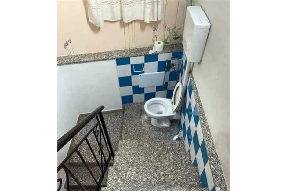
This emergency lavatory is perfect for anyone regularly caught short on their way up or down a long flight of stairs. At least the designer tried to make it a nice place to stop by adding floral wall art and bathroom tiles.
The real question is: where do we wash our hands?
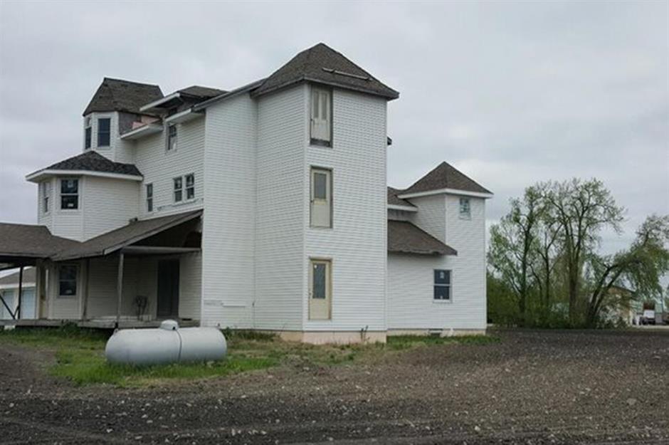
Tree house or house tree?
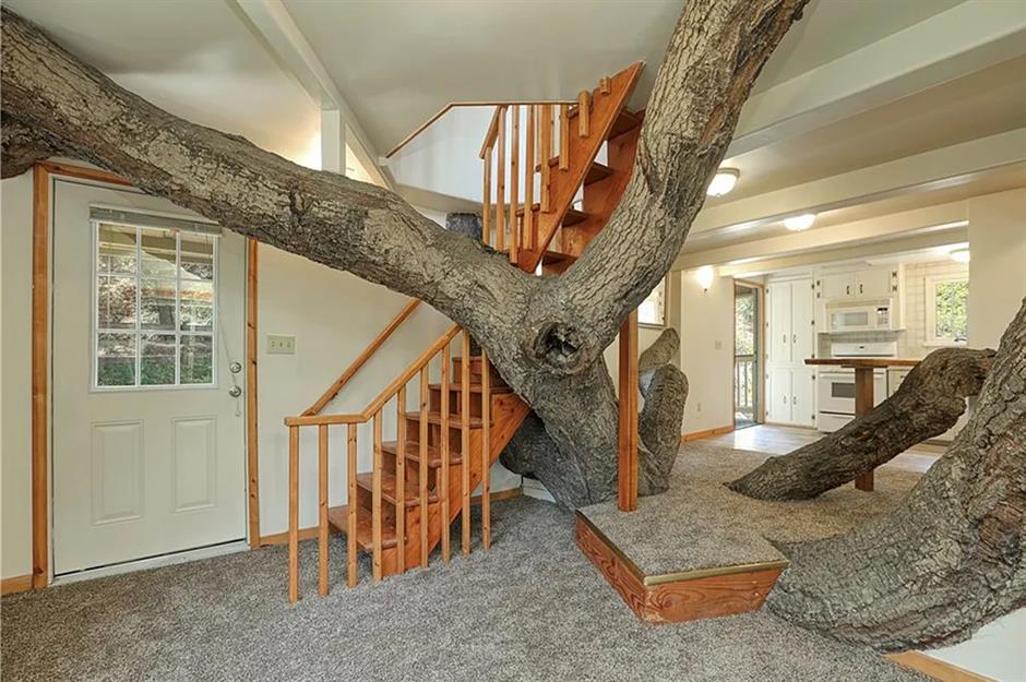
It's hard to wrap your head around what came first – the tree or the house. While it appears a giant oak has burst through the foundations of this property, on further inspection, everything from the walls to the staircase has been built around these gargantuan trunks.
This "one-bath tree house" hit the market in June 2023 for $3.4 million (£2.6m). The price was later lowered to a shade under $3 million (£2.3m). While it's not to everyone's taste, you can't deny it makes a refreshing change for a builder to work around an existing tree instead of cutting it down!
Loved this? Discover more unusual homes from around the world